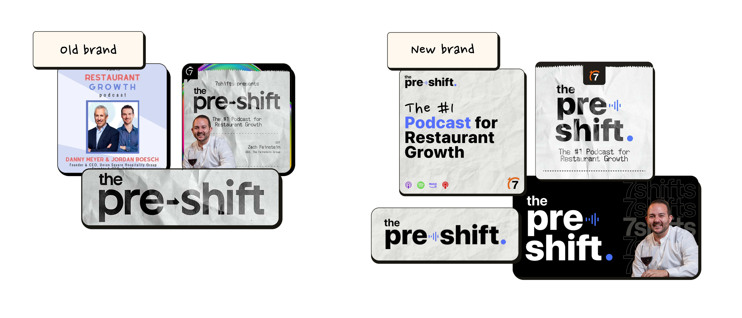
Pre-shift 2.0
Brand lift
Preshift Podcast Brand Lift – Modernizing with Intent
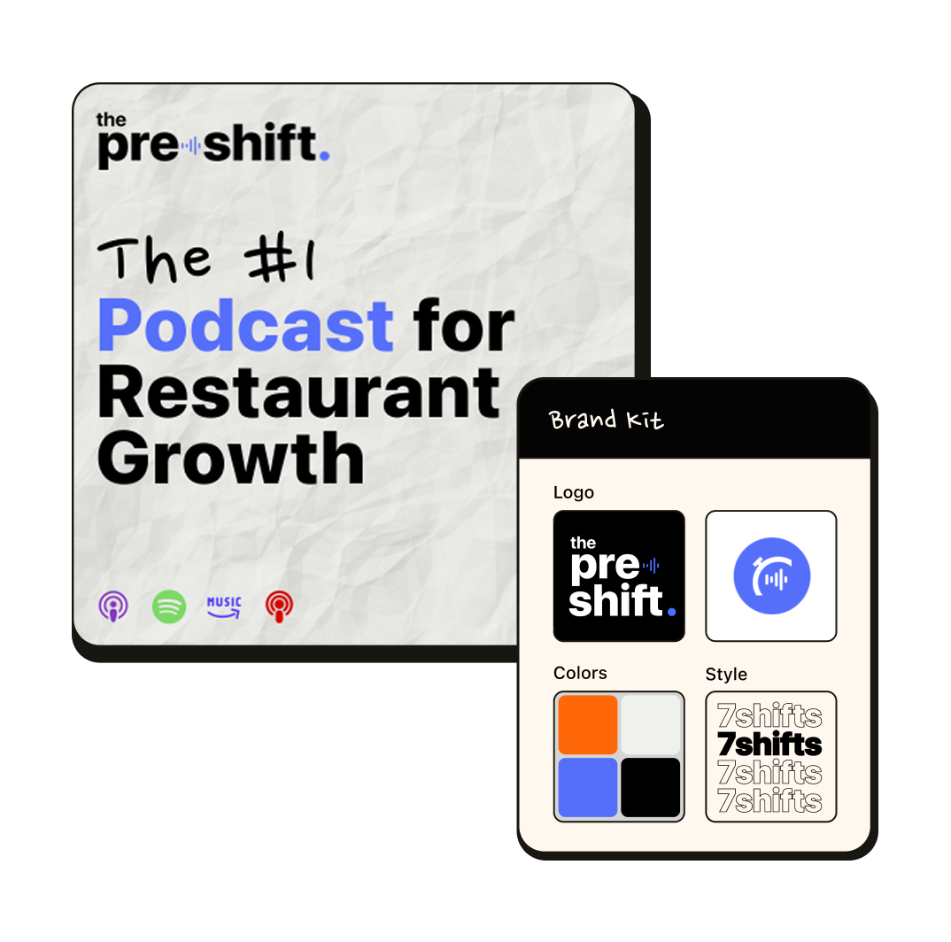
As part of the 7shifts redesign, I led the visual refresh for Preshift, the company’s hospitality-focused podcast. I introduced an updated logo, refined colour treatment, and a new design system for ongoing podcast album covers.
One of the key challenges was the outdated workflow for creating episode cover art, which involved unnecessary back-and-forth between Figma and Photoshop. I simplified the process by building a streamlined, flexible design system fully in Figma making it easy for the team to create polished, on-brand episode graphics quickly and consistently.
The refreshed identity gave Preshift a distinct look that stood out while staying visually tied to the broader 7shifts brand.