
7shifts rebrand
Brand Identity
Rebranding 7shifts: Helping a growing platform find its voice

Being part of the 7shifts rebrand was one of the most fulfilling experiences in my career. As a brand designer on the team, I helped lead the new visual direction and bring it to life across campaigns, design systems, and digital touchpoints. The goal wasn’t just to make things look good, but to build something the team could genuinely use and call their own.
Project scope:
As 7shifts grew from a scheduling tool into a full team management platform, the brand needed to evolve with it. I was one of the creative leads on the rebrand, owning key deliverables across the visual identity, landing pages, email system, and marketing collateral.
Two projects defined my contribution to this rebrand:
A design system that became the team standard, and a landing page that helped reposition an entire product. Scroll to see both.
Email Design System
Brand Guidelines into Functional Email Systems
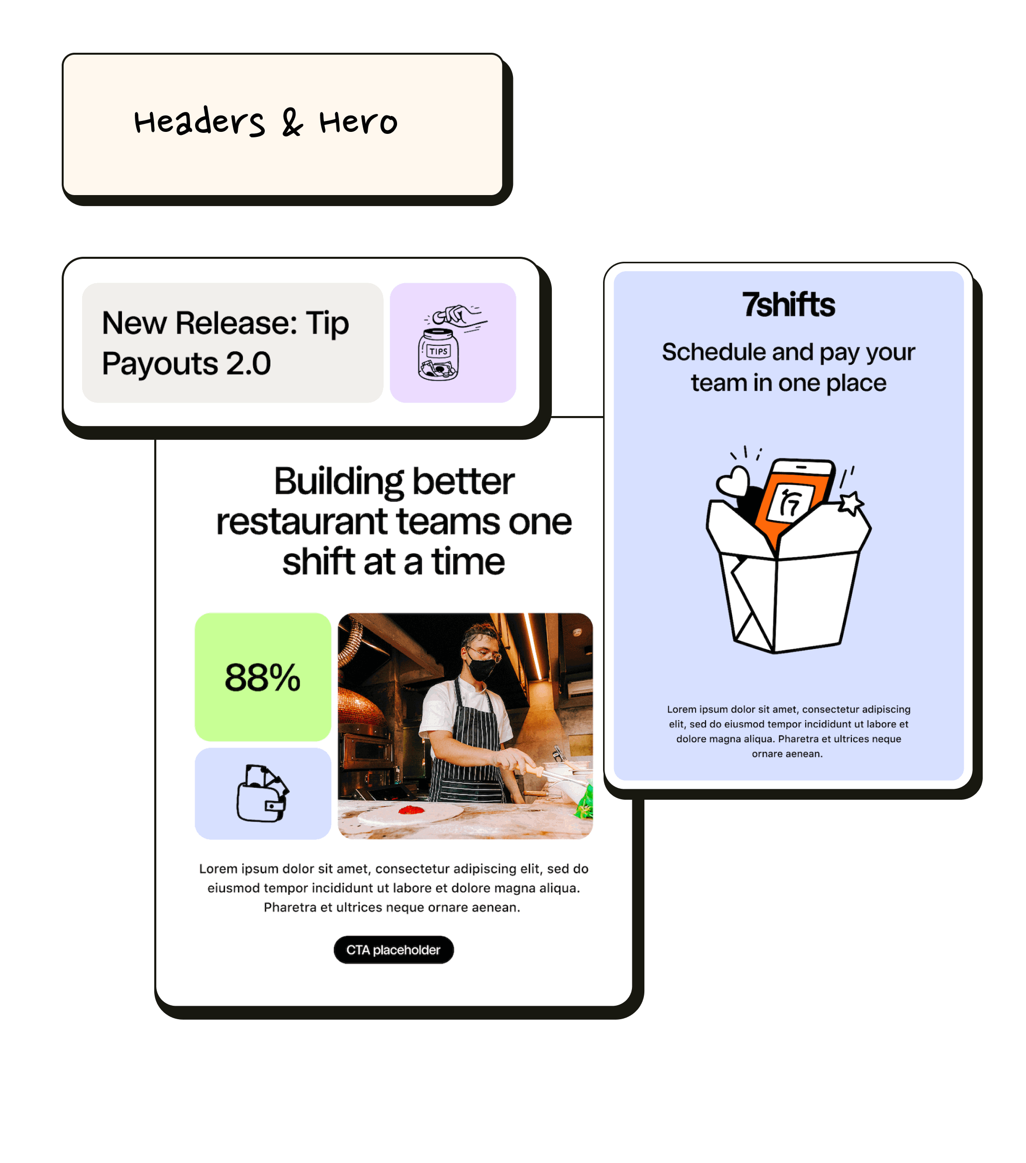
Summary
Email was a key focus of the 7shifts rebrand due to its role as a primary customer touchpoint.
I designed a modular email system rooted in the new brand direction, enabling the marketing team to create consistent, on-brand emails independently.
It was fully adopted and remains the standard today.
Role
Design lead, in collaboration with Marketing and Automation teams.
Scope
Strategy, creative direction, visual identity, modular email system, component library, template design, Figma documentation
Challenge
One of the main challenges was the time it took to ship emails. The team relied heavily on design for every send, creating bottlenecks and slowing down execution. I approached this by designing a modular email system grounded in the most common use cases across the organization, giving the team flexible, ready-to-use templates they could adapt without needing design support each time.
Solution
I designed a modular email system rooted in the new brand direction, starting with an audit of existing emails across different teams to understand common patterns and needs. From there, I built flexible components including hero and header variations, grid and gallery layouts for more visual sends, and templates for copy-heavy emails, promotions, product updates, and newsletters. Everything was thoughtfully structured and documented in Figma, making it easy for the marketing team to build polished, on-brand emails quickly and independently.
Impact
The system significantly reduced the time it took to ship emails by removing the need for design involvement on every request. It gave the marketing team more autonomy, allowing them to create and send on-brand emails independently. The templates were fully adopted across the organization and became the standard still used today, improving both consistency and overall workflow efficiency.
This shifted email from a design-dependent workflow into a scalable system the team could own and evolve.
Payroll Landing Page
Designing the page that helped reposition a product

Summary
This project focused on repositioning 7shifts Payroll through a dedicated landing page designed to shift perception from an integration to a core part of the platform. The goal was to connect scheduling and payroll into a single, cohesive narrative that felt clear, valuable, and easy to understand for restaurant operators.
Role
Brand Designer. I led the design of the landing page from concept through execution, partnering with marketing and product teams to align messaging, structure, and visual direction.
Scope
Landing page design, product positioning, visual storytelling, conversion-focused UX, responsive design, Framer handoff
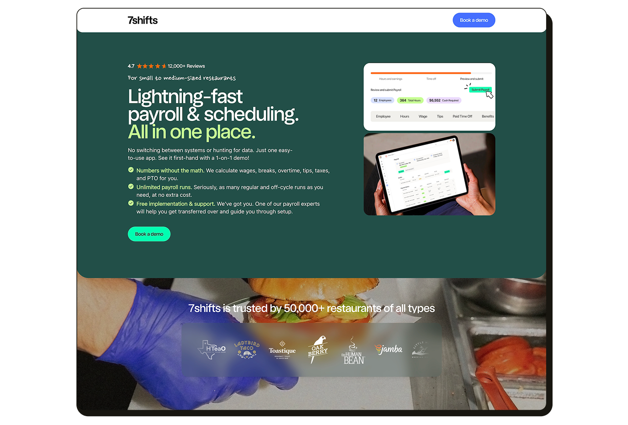
Challenge
Payroll was being introduced as an integration, but users did not yet see it as a core extension of the 7shifts platform. The challenge was to shift perception while still driving conversions through paid campaigns. The page needed to move beyond feature explanation and establish payroll as part of a unified system.
Solution
I developed a sub-brand for Payroll within 7shifts, using a curated subset of the brand palette and a set of payroll-specific icons to establish clearer visual distinction.
I then extended this system across all key touchpoints, including the landing page, campaign assets, email design, and social ads, to reduce visual dilution and create a more cohesive and intentional presence for Payroll across channels.
Impact
The sub-brand improved clarity and recognition of Payroll within the 7shifts ecosystem. It strengthened engagement from paid social traffic and increased interaction with key conversion points on the landing page, including the “Book a demo” CTA. Overall, it helped improve how effectively Payroll was positioned and understood across channels.