
Voices Report 2026
Creative Direction
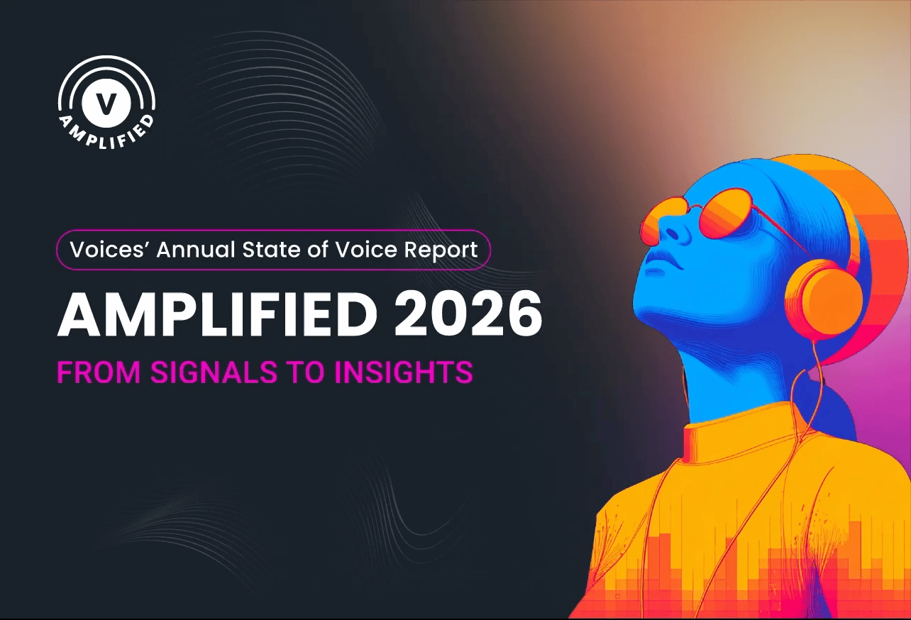
Designing Voices Amplified: Building a sub-brand to stand on its own
This project asked me to build something that could stand entirely on its own.
Voices approached me to design the creative direction for their 2026 annual State of Voice Report, Amplified: From Signals to Insights. The brief was clear: create a sub-brand that felt distinct from Voices, bold enough to command attention, and cohesive enough to carry across every touchpoint from a fully interactive PDF to social campaigns and email.
I came in as the sole designer and creative lead. I developed the concept, designed the logo, built the color system, created the illustrations, and executed every deliverable from start to finish. What made this project interesting was that the creative challenge wasn't just visual. It was about navigating two competing visions and finding the version that could satisfy both without compromising either.
Role
Creative lead, graphic designer, web designer
Project scope:
Brand identity, art direction, website design, editorial & graphic design
Amplified Voices State of Report
Designing a data-driven report with its own identity
Summary
Voices needed their 2026 annual report to feel like its own world. Amplified had a name and a direction, and my job was to give it a complete visual identity and carry that through a fully interactive PDF, social graphics, and email campaigns.
Tools
Figma, Adobe Illustrator, Midjourney, Claude
Deliverables
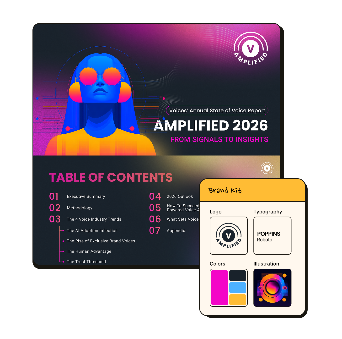
Sub-brand identity including logo, color palette, and graphic elements
Custom illustration system
Fully interactive PDF report
Social media graphics
Email campaign design
Challenge
The biggest tension on this project came from competing stakeholder visions from the start. The internal design team wanted something clean and restrained, while the marketing director wanted bold, loud, and impossible to ignore. Finding the middle ground without defaulting to either side was the first real creative problem to solve.
A second challenge arrived mid-production. After completing roughly half of the approved report, copy and layout direction changed significantly and I had to iterate quickly without losing momentum or quality.
Solution
I designed a logo anchored by the Voices symbol surrounded by radiating sound waves, a visual nod to amplification that felt editorial and ownable. Four bold colors ran consistently across every deliverable, from the PDF to social graphics and email campaigns.
For illustration, I used Claude and Midjourney to lock in a distinct visual style, then refined everything in Adobe Illustrator. The AI-assisted workflow gave me more room to push the creative direction within a tight turnaround.
When copy and structure shifted mid-project, building everything in Figma with auto layout from the start meant the changes were clean and fast.
Impact
The bold illustration style resonated across both teams and was adopted as the visual standard for all future Amplified campaigns. The designs didn't just deliver for this report. They became the template for reports to come.
The report went live across all channels, and the accompanying social media campaign drove an 18% increase in reach and impressions compared to the previous annual report, a measurable step forward for a piece of content that had previously gone out without a dedicated visual identity behind it.